Welcome to Church: First-Time Visitor Guide
Visiting a church for the first time can be exciting for visitors but yet an unfamiliar…
Read More →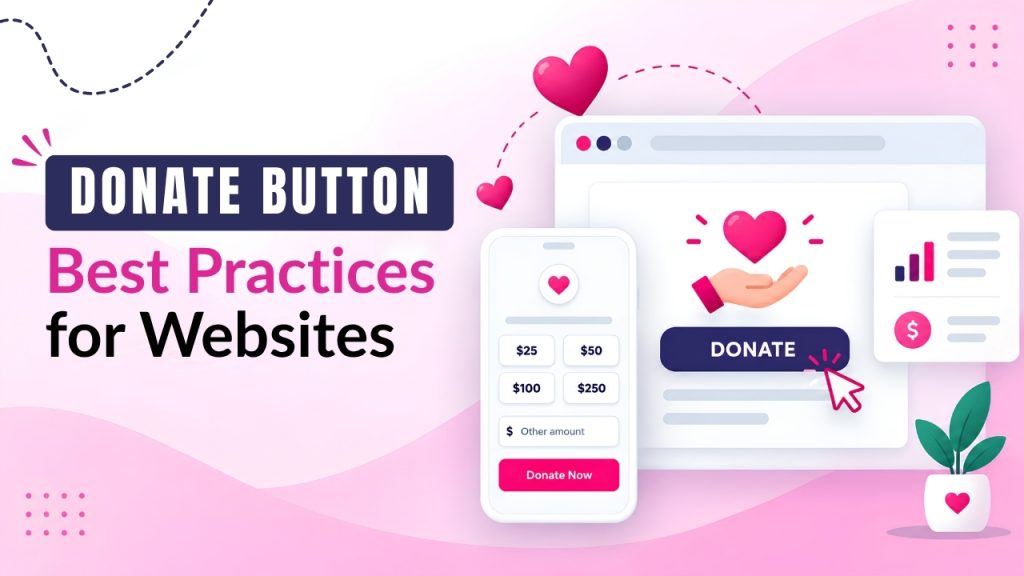
Short on time? Let AI do the work. Get the key points.
Having a prominent donate button offers visitors of websites a convenient way for donors to support a nonprofit, charity, or community organization. But simply adding a donate button to the website page does not guarantee that they will receive more donations.
An effective donate button best practice should focus on prominent placement on a website, including clear messages, must be accessible, compatible with mobile devices, gain trust, and provide a smooth donation experience for supporters.
Having a noticeable donate now button can encourage people to take the next action and donate. While providing a simple donation form helps visitors to reduce unnecessary steps during the donation process.
An effective nonprofit website must have the donation button placed where people can easily locate across the homepage, navigation menu, campaign pages, blog posts, and important program pages.
Displaying strong call-to-action(CTA) words, appropriate donation amounts, recurring giving options, and secure payment processing can make the giving process even more convenient for supporters.
A dedicated donation page should work smoothly on smartphones, tablets, and desktop devices, especially as donors highly interact with nonprofit organizations through digital channels.
For running online donations successfully, it is essential for nonprofits to gain trust of donors. When nonprofits clearly give details about their organization, provide secure checkout, and instant payment confirmation help nonprofits to gain trust of their supporters.
By using an integrated online giving platform, nonprofits can connect donations with recurring donations, donor records, receipts, campaign tracking, and reporting.
Platforms like SimplyGiv help nonprofits to create convenient digital fundraising experiences while managing important giving activities through their websites.
Also Read: How to Set Up Multiple Funds and Split Giving Online
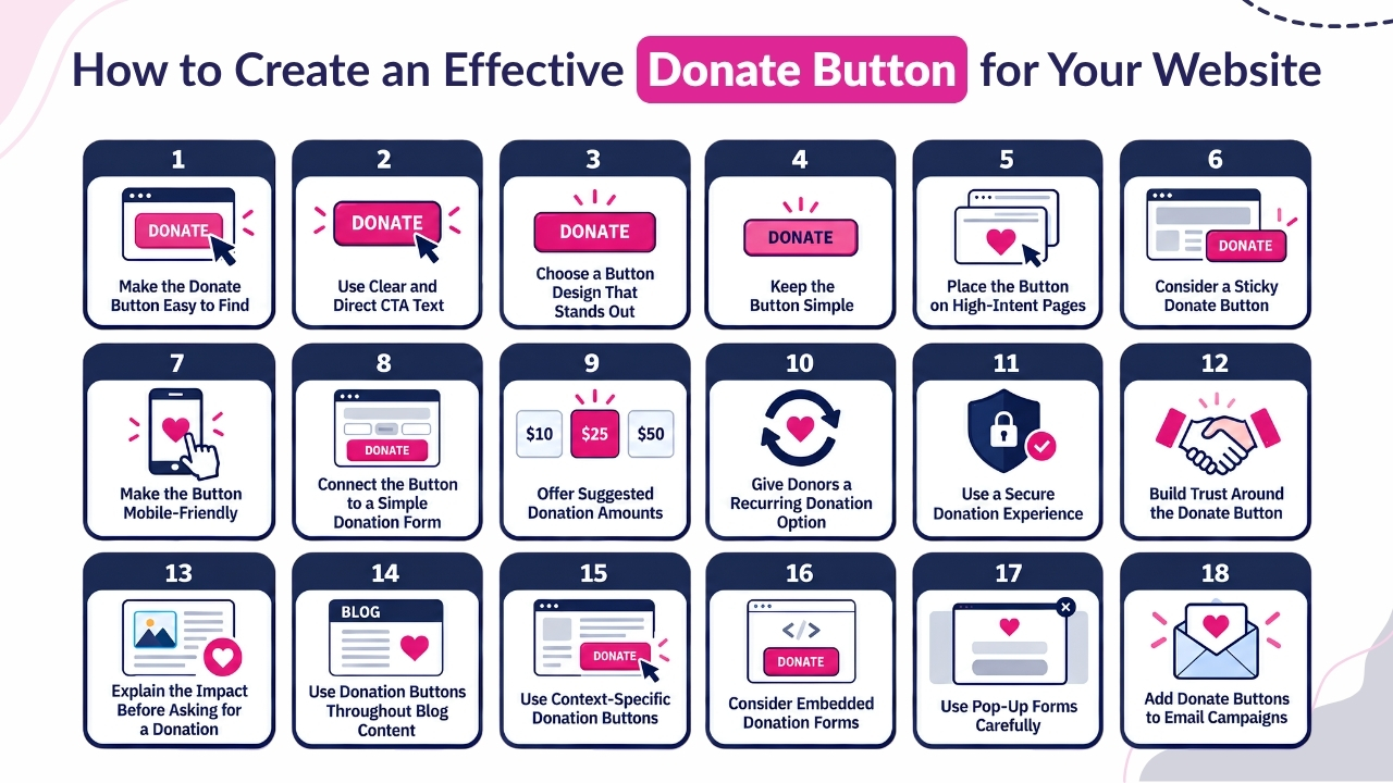
For an effective donate button, nonprofits must use clear Calls To Action, mobile friendly design, place a donate button prominently and encourage trust and more people to donate.
Below are the key donate button best practices for websites nonprofits should consider.
The first important requirement of an effective donate button is to make the button easy to find. Because website visitors should not have to search through multiple pages before trying to donate. They must place the donate button prominently on different pages throughout the website.
The header is an important spot for placing the donate button because it is one of the first elements that visitors see when they login to your website. They can also place donate amount calls to action on essential pages, like:
The donate button must be placed prominently in the upper-right area, and they must also consider using a sticky button so it remains visible even while they scroll the page to the bottom.
Nonprofits should not place the donate button everywhere. Rather they must identify the pages where visitors usually are more interested in supporting the nonprofit organization.
A donate button should clearly direct visitors exactly about the next page that will open when they click it. Adding clear action based words reduces chances of supporters getting confused and helps supporters to understand the next step.
Although “Donate” is a simple and familiar word, nonprofits can use more specific words in their Call to Action text that aligns with the purpose of their campaigns and connects with a broader audience.
Useful CTA examples include:
Words should remain short and easy to scan. Supporting text can provide details about the organization’s mission, while the CTA button should make the desired action immediately clear.
Also Read: How to Increase Church Donations with Online Giving Tools
A donate button should be easily noticeable for supporters and must naturally blend with the website. Its design should attract attention and clearly separate the donation CTA from regular navigation links, while still matching the organization’s overall visual identity.
While designing the button, consider these below important points:
A well-designed donate button must provide visibility, branding, readability, and accessibility that makes it easier for visitors to take further action and donate.
The donate button should be clear, recognizable, and easy to use. The donate button should be simple, noticeable, and easy to understand unlike using complex icons, heavy graphics, or animations.
Because even a simple donate button design can convey the action more instantly and help visitors to understand the next page that they will navigate to when they click. A clear label like “Donate Now” can make the purpose immediately obvious.
The donation button should be noticeable against the surrounding content while maintaining a balanced and professional appearance. Its design should support the website’s overall appearance while keeping the donation button call to action easy to find.
Avoid:
Further pages can include photos, videos, testimonials, statistics, and impact stories to build trust. However, the donate button should remain simple and focused. Having a minimalist approach with clear words can make the Call to Action more effective.
Not every website visitor is instantly ready to make a donation. Some people may be researching an organization, reading educational content, exploring a program, or learning about a specific cause.
Due to this reason, nonprofits should place donate buttons on high-intent pages where visitors are more likely to feel connected to the organization’s mission. The Call To Action should match the page’s content, helping visitors to see how their donation can directly contribute to the featured program, campaign, or cause.
Examples:
Contextual Call To Actions can make the donation opportunity feel more relevant because visitors already understand the purpose of the program or cause.
Instead of showing the same generic button everywhere, nonprofits can adapt the Call To Action to the page content and offer a clear link between the visitor’s interest and the potential impact of their donation.
Also Read: 25 Online Fundraising Ideas for Nonprofits to Raise More Donations
A sticky donate button remains visible even when visitors scroll through the whole website, that helps supporters to access the donate button even without needing to scroll back to the top.
Sticky Donate buttons can be essential on long pages where visitors spend time reading detailed information before they decide to donate.
Sticky Buttons Can Be Useful For:
Use sticky buttons so that the giving option is accessible for supporters but also ensure that the sticky buttons should not hide essential content or affect mobile navigation.
Mobile optimization is also essential for nonprofit websites. Because today most people search and find giving options through social media, email, QR codes, text messages, search results, or shared campaign links.
And if the donate button is difficult for supporters to find on their smartphone then there are high chances that visitors may abandon the donation process.
So nonprofits must test the donation buttons and forms on different mobile devices and screen sizes to offer a smooth giving experience for donors.
Check the Following:
Responsive design and testing across different devices can help create a more accessible and convenient donation experience.
A well-designed donate button should lead visitors to a simple and focused donation form. After clicking “Donate Now,” supporters should be able to complete their donation without unnecessary questions or complicated steps.
A lengthy donation form can frustrate and discourage people from completing their donations. The donation form should gather only the details needed to process and acknowledge the donation.
Based on the organization’s requirements, a simple donation form may include:
The donation form should include only relevant fields based on the requirements of nonprofits and supported payment methods, and thereby ensuring that donors are able to complete their donations quickly and easily.
Also Read: Top Online Fundraising Ideas to Grow Donations Fast
Nonprofits must offer suggested donation amounts that can make the giving process easier by helping visitors to instantly choose the donation amount that they want to donate.
Instead of asking supporters to enter donation amounts, nonprofits can show preset donation amounts and a custom donation amount field.
For instance: $20, $50, $100, $250, Custom Amount
The suggested donation amount should match with the supporters of organization, campaign objectives, and usual donation levels. Nonprofits can also explain available different donation amounts that may help to accomplish when accurate details are available.
Examples:
These descriptions help donors to understand the value and initiative for which they are donating. But, organizations should ensure that donation impact statements are added based on genuine costs.
They must avoid making unsupported donation claims just to encourage more donations. A custom donation amount option should be available for donors who prefer to select their own donation amount.
Providing donors with a recurring donation option helps nonprofits to create a consistent source of income. Unlike a single donation, nonprofits can allow donors to choose a donation option as per donor preferences.
Donation Options May Include:
They must ensure that the donation frequency aligns to the fundraising model and donation platform. SimplyGiv supports both one-time and recurring donations through online donation forms.
Nonprofits must clearly provide recurring donation options and ensure that their donors know that their selected donation amount is a single payment or a recurring donation before completing the donation.
Donors must trust your website or donation experience while entering their personal and payment information online. A secure donation process can make visitors more comfortable while completing their donations.
Nonprofits should use trusted payment systems and explain security measures clearly.
Key Security Considerations:
SimplyGiv states that it uses PCI DSS-compliant processing, tokenization, role-based access, and activity logs. Nonprofits should review their provider’s security practices and protect donor details appropriately.
Also Read: Raffle Ideas: 50+ Creative Ideas
Visitors may hesitate to donate when they are unsure the way their donation amount will be used. They must clear trust signals near the donate button that help customers to address these problems and make visitors feel more confident. They must keep the donation information simple, valid, and easy to find.
Useful Trust Signals:
Such details can answer common questions and reduce problems before visitors decide to donate.
A donate button is more effective when it appears within a clear and impactful fundraising message. Visitors are more likely to consider donating when they understand the problem, the organization’s response, and how their support can make a difference. They must provide enough context before presenting the donation Call To Action.
Explain These Key Points:
For example:
Your support helps us provide essential resources to families in our community.
[Donate Now]
They must keep the message honest, specific, and consistent with the organization’s actual work.
Nonprofit blogs attract visitors who may not quickly visit a donation page. Readers may find an article through search engines, social media, or email newsletters and become interested in the nonprofit organizations even while reading.
They must add valid donation calls to Actions within blog content to link useful information with fundraising opportunities.
Where to Add Donation CTAs:
For instance, use “Support Our Environmental Programs” or “Help Us Continue this Work.” SimplyGiv supports placing donation forms, buttons, and links across website pages and content areas.
Also Read: Donation Form: Best Practices Guide for Nonprofits
Nonprofits do not need to use the generic donate button across every website page. Using context-specific CTAs make the donation request more valid to the way visitors are viewing or reading. Their words should clearly align the purpose of the page after clicking.
Examples of Context-Specific CTAs:
Relevant Call To Action words can help visitors to understand what their donation supports. The essential aspect is to maintain consistency between the button message, page content, donation purpose, and destination.
Offering an embedded donation form allows visitors to make a donation directly on a website page without navigating through several separate pages.
Such an approach can create a simpler and connected donation experience, especially for visitors who are interested in a specific campaign or cause.
Benefits of Embedded Donation Forms:
SimplyGiv supports embedded donation forms and donation buttons that can be placed directly on website pages.
Also Read: Winter Fundraising Ideas That Actually Work
Some donation systems allow a donate button to open a form in a pop-up or modal window. This approach can reduce navigation steps and make giving more convenient.
However, nonprofits should test pop-up forms carefully to ensure they do not interrupt the visitor experience or create accessibility issues.
Important Considerations:
A well-designed pop-up should simplify giving without distracting visitors from the page.
Email campaigns can be an effective way for nonprofits to connect with supporters and encourage donations. A fundraising email should include a clear Call To Action that guides readers to the appropriate donation page.
Donate button words should align with the purpose and message of the email.
Examples of Email CTAs:
Target should align with the email. Because if the message promotes a certain campaign, link the button directly to the donation page of campaigns rather than being a generic homepage.
Donation buttons can also be included in email campaigns and other online channels to make giving more accessible to supporters.
A well-designed donate button can make it easier for visitors to support a nonprofit and complete their donations with confidence. The button should be clear, noticeable, accessible, mobile-friendly, and consistent with the organization’s website design. Its placement and wording should also match the visitor’s intent and the content of the page.
Nonprofits can strengthen the donation experience by connecting buttons to simple forms, offering recurring giving options, using relevant calls to action, and explaining the impact of donations before asking for support. Trust signals, secure payment processes, embed donation form, email CTAs, and QR codes can further support convenient giving across different channels.
Most importantly, organizations should regularly test their donation experience on different devices and review the complete journey from the initial CTA to confirmation. A simple, trustworthy, and focused process can reduce barriers and encourage more visitors to become donors.
If you still have any query about Donate button best practices for websites then you may Schedule a Call at Simplygiv and we are more than happy to assist you.